“Lively. Radiant. Lush… A color of elegance and beauty that enhances our sense of well-being, balance and harmony.” This week Pantone chose Emerald as their 2013 Color of the Year. Sophisticated and luxurious, emerald is associated with prosperity and renewal. And it’s no surprise. Whether a glittering gemstone or a fresh sapling, the color green is a natural beauty. Are you looking to go green in your own home? Get your chloro-fill with these green-inspired design tips.
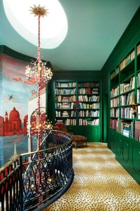
Once considered an accent color, green is now taking over as a mainstage design staple. Available in an endless array of shades and tones, green is versatile and can be dressed up or dressed down depending on the mood. Combine a bright shade of green with other vibrant hues to add excitement and energy to your décor.
Hutton Wilkinson – Harper’s Bazaar
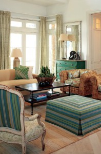
Or tone it down with some soft neutrals to create a more sophisticated ambiance.
Billy Roberts – Atlanta Homes and Lifestyles
In general, blue-greens and grass-greens (colors associated with nature) are more calming, while yellow-greens like chartreuse and lime are better for a brighter space. The options are endless, but it’s important to make sure your tones don’t clash. Don’t mix the two together!
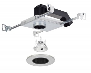
When it comes to lighting your room, going green isn’t just about the color— it’s about sustainability. Why settle for anything less than energy efficient? Creative System Lighting offers the Green GOOD DESIGN Award winning Eco-Downlight LED Mini, a smaller version of their popular Eco-Downlight. This Energy Star compliant fixture is admired for its enormous energy and maintenance savings, using just 14, rather than 50, Watts.
Do you have your own green design tips? Let us know in the comments section below!
Sources:
http://www.houseofturquoise.com/2012/12/2013-pantone-color-of-year-emerald.html
http://www.sheknows.com/home-and-gardening/articles/952393/decorating-with-the-color-green


